
SNBT Plus - Brand Identity & Positioning
Developed a vibrant, illustrative wordmark logo and comprehensive brand identity system for SNBT Plus, a Gen Z-targeted test preparation service. Strategic brand positioning that balances approachability with authority.
Overview
SNBT Plus is a dedicated test preparation service designed to guide students through the Indonesian national university entrance exam (SNBT). The project involved creating a comprehensive brand identity that was energetic, youthful, and highly engaging. The primary objective was to immediately communicate the brand's core value proposition: 'SNBT Plus' is not just another study guide, but a 'strategic toolkit' for successfully navigating the test. The target audience is primarily Generation Z, a demographic that responds to authenticity, energy, and clear, solution-oriented messaging.
Brand Identity System
Strategic Color Palette
Blue (S - Selection)
#1E40AF
Red (N - National)
#DC2626
Orange (B - Brain)
#EA580C
Yellow (T - Test)
#FBBF24
Each color represents a distinct element of the SNBT journey: Selection → National → Brain (Solutions) → Test Success
Logo Component Breakdown
S - Seleksi (Selection)
Mortarboard icon symbolizes university admission goal
N - Nasional (National)
Pencil in negative space represents written test
B - Berbasis (Brain)
Glowing brain/lightbulb symbolizes critical thinking & solutions
T - Tes (Test)
Clean, bright yellow represents clarity & success outcome
Brand Positioning Metrics
Design Impact Assessment
Typography & Design System
Main Wordmark
SNBT
Custom-made font: Bold, rounded, soft sans-serif for Gen Z appeal
Solution Element
Plus
Lighter, raised (superscript) position represents the added value
Tagline
STRATEGI, TRIK, TAKTIK & SENJATA JITU LULUS JALUR TES
Verbal anchor that explicitly defines the solution promise
Challenge
The SNBT exam is a high-stakes, high-stress event for students. The market for preparation materials is crowded, often falling into two unappealing categories: too formal (legacy brands that feel dated and disconnected from youth) or too chaotic (newer brands that are vibrant but lack credibility). The challenge was to strike a precise balance—de-stress the topic while building a strong sense of credibility, making test prep feel approachable and even fun.
Solution
Developed a vibrant, illustrative wordmark centered on the core philosophy of 'The Strategic Toolkit.' Visually deconstructed the 'problem' (SNBT) and embedded the 'solution' (Plus) within the design. The logo systematically explains its own value: 'S' topped with a mortarboard (university goal), 'N' containing a pencil (written test reference), 'B' with a glowing brain/lightbulb (critical thinking & solutions), and 'T' in bright yellow (clarity & success). The period acts as a visual full stop, separating problem from solution. 'Plus' appears in a rainbow gradient, representing the variety of solutions offered.
Results
Created a distinctive, memorable brand identity that immediately resonates with Gen Z audiences. The logo serves as both a visual and conceptual anchor, clearly communicating the brand's unique positioning. The design successfully balances professionalism with youthful energy, making SNBT preparation feel less intimidating and more achievable. The multi-color gradient and custom typography ensure the brand stands out in a crowded market while maintaining credibility.
Key Features
Skills Deployed
Other Projects
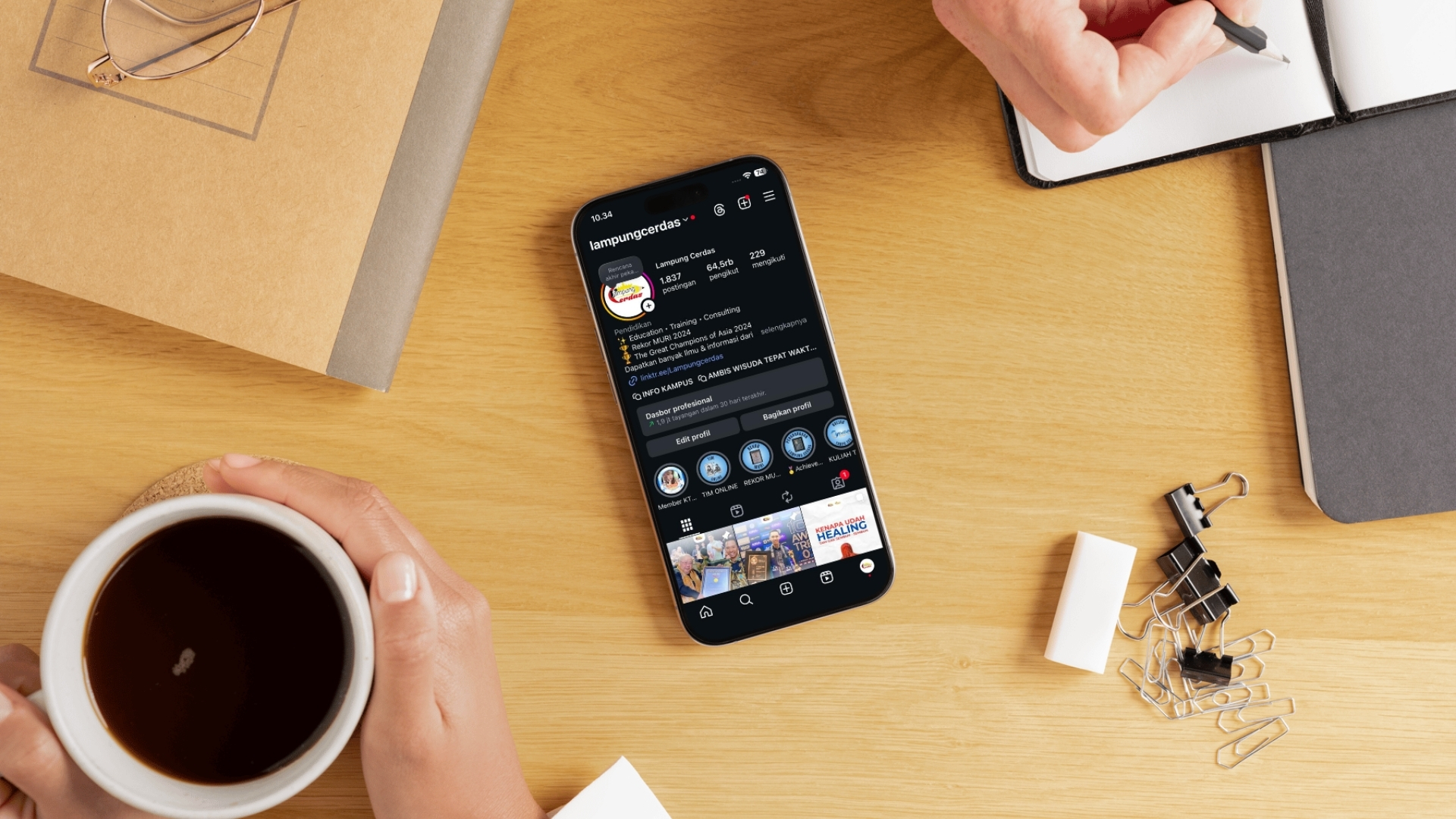
@lampungcerdas Instagram Strategy
Strategic management of Instagram account from 64,575 followers, driving 2.6M+ post views and 626 website conversions through data-driven content strategy.
Kuliah Tanpa Tes - Brand Identity & Design Strategy
Developed innovative brand identity for Kuliah Tanpa Tes that overcomes skepticism through strategic color-coded visual separation of academia (blue) and innovation (orange).

Lampung Cerdas YouTube Channel
Scaled EdTech YouTube channel from ground up to 185,333 subscribers with 6.3M+ views through strategic content production, live streaming, and data-driven optimization.